
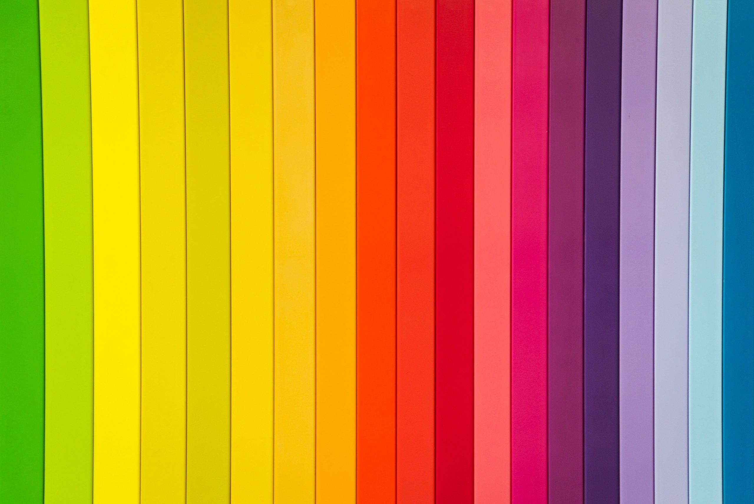
As marketers, we are aware of the importance of being deliberate about color choice in our work, whether it be logo design, campaign imagery, or branding efforts. Colors are the first elements people notice before their brains are able to process the imagery in front of them. That is why the idea of color psychology has become so widespread in the marketing industry and is often looked to for guidance on a wide range of projects. Color psychology is defined as, “the study of how colors affect perceptions and behaviors”. In marketing specifically, color psychology focuses on how certain colors influence brand perception and either drive or deter consumers from patronizing certain businesses. Below you’ll find a brief overview of commonly used colors, and the subconscious perceptions they are said to create.
Red
Color experts have classified the color red as one associated with power, love, or fear. Red often evokes very strong feelings and is used when brands are trying to make a statement. Take ESPN for example ‐ I bet you can hear the hard-hitting beats of their introduction in your head, perfectly complimenting the bright red logo. Everything about EPSN is meant to grab viewers’ attention. This is the goal when using the color red in branding.

Orange
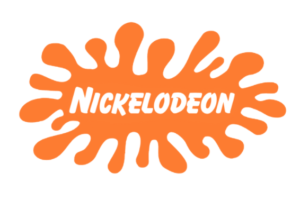
Orange is often associated with physical comfort, warmth, and is thought to be yellow’s more playful cousin. This bright color is associated with high energy, which is why it’s used by many brands whose target audience is younger, as in the case of Nickelodeon. Etsy, a company dedicated to creating a marketplace for art and creativity is another company that fittingly utilizes the color orange to tap into the playful nature of the brand.
Yellow
Many can agree that yellow signifies happiness, cheerfulness, and optimism. Brands looking to create a friendly connection with their consumer base often implement yellow in their branding and logo design. Snapchat is one such organization that utilizes the color yellow. Their app, devoted to bringing people together and maintaining communication reflects the values of friendship and cheerfulness that people tend to associate with this color.

Green
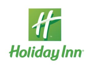
The color green is considered to be reminiscent of balance, calm, and growth. Green is believed to relax the mind, serving as a fresh start for brands that are looking to create a more serene feeling amongst their consumers. The Holiday Inn hotel chain chose green for a reason; they want to portray their hotels as a place for relaxation and rejuvenation, and a green logo is one way to subliminally push that message.
Blue
Blue is the one of most widely used colors in marketing. Blue is associated with being soothing, dependable, reliable, and like green, calm. Types of brands that take advantage of blue’s connotation are often healthcare or medical brands that are looking to capitalize on the trustworthiness associated with this color. brands like Chase and American Express also incorporate these ideologies through their use of blue. When looking at companies with blue logos, reliability is a usually key element of their Credit card values.

But is implementing color psychology really the best way to create a memorable, well-perceived brand? In short, no. It certainly helps in terms of establishing a subconscious association with certain values, however; it must be said that just because your logo is blue does not mean people will automatically trust your brand. Humans all have unique life experiences that lead them to perceive colors in very different ways. While color psychology can be used as a general guideline, at the end of the day, everybody sees color differently, either because of emotional connections or physical traits like colorblindness, so color psychology shouldn’t be used as the end-all-be-all of color choice. Psychology aside, marketers can agree that it’s more important that your brand color “fits” your product or service. These color associations can be used as a starting point when determining how you want consumers to perceive your business, but don’t be afraid to diverge from these guidelines. Every company is unique and you want your color choice to reflect that.
Here at Paperkite, we have experience in branding and know just how to choose colors that fit your brand and make your business stand out. If you’re reevaluating your brand’s color choice or just getting started book an appointment with us today. We’d love to talk more about what colors work best for you.